Open and Accurate Air Quality Monitors
We design professional, accurate and long-lasting air quality monitors that are open-source and open-hardware so that you have full control on how you want to use the monitor.
Learn Moreby Ethan Brooke on January 10, 2025
We were thrilled to recently hear about Google Maps’ new feature overlaying air quality information directly onto the map! As passionate advocates for clean air, we believe that spreading awareness about air quality is always a step in the right direction - and it’s a cause at the heart of our mission. Seeing such a widely used platform take this step felt like a major win for anyone who cares about the quality of the air they breathe.
The Google Maps’ air quality overlay provides an at-a-glance view of pollution levels in different locations, making vital information more accessible than ever. Until now, people often had to seek specific platforms to check air quality data. However, by adding it directly to Google Maps - an app that many people already have on their phones - this information is becoming more widely accessible, and we love seeing this kind of progress!
Naturally, this got us thinking: how reliable is the air quality data being displayed? Out of curiosity, we compared the data from some of our monitors on the AirGradient Map with the readings shown on Google Maps and noticed a surprising difference. While both values pointed to unhealthy air quality, the disparity raised an important question. Is Google lying to us, or is there another explanation for this difference in data?
In this post, we’ll dive into the possible reasons behind such discrepancies, explore how air quality data is gathered and calculated, and discuss what this means for anyone checking AQI numbers on Google Maps. If you’ve ever found yourself wondering whether you can trust those air quality readings, this article will help you understand what’s behind the numbers.
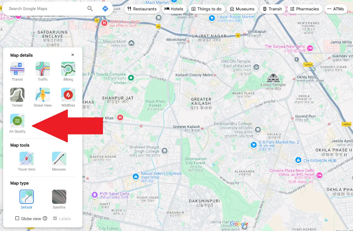
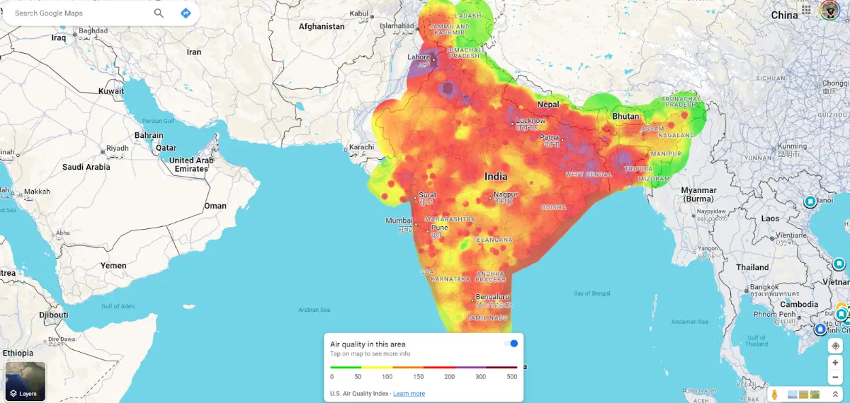
The new air quality overlay, announced in late August 2024, can be enabled on both the browser map and the smartphone app. While anyone can turn on the overlay regardless of location, the data is currently available only for certain regions, meaning the feature may not be useful for everyone. At present, coverage includes North America, much of Europe, India, South Korea, Japan, and Australia.

Once you’ve enabled the air quality layer, the map visually transforms, with colours indicating the air quality in each area. Instead of using a standardized AQI like the U.S. EPA AQI or the European AQI, Google has created its own AQI system, which may calculate and present data differently. This can lead to differences when compared to national or local air quality platforms, such as the EPA AQI in the U.S., the European AQI, or India’s NAQI. These differences may be due to varying formulas, data sources, or pollutant weightings.
Since the feature is still new, it will likely see many updates and improvements over time. As it stands, the overlay lacks advanced features like the ability to view historical data for specific locations or more detailed information on individual pollutant concentrations. However, it’s an excellent tool for quickly checking current air quality at a glance and raising awareness about air pollution issues.
Unfortunately, it seems that nothing in life is ever simple. While AQI stands for air quality index, and it’s often believed to be a universally used way to measure air quality, there are actually many different air quality indexes. If you’re from the U.S., you will have likely seen values reported on the U.S. EPA AQI index. On the other hand, if you live in India, you will likely see values from the Indian NAQI. These different indexes are used for various reasons, but the primary defence for having many different AQIs is that each can be tailored to local conditions, such as prevalent pollutants. To make this more complex, Google doesn’t use any of these indexes and has, instead, created its own.
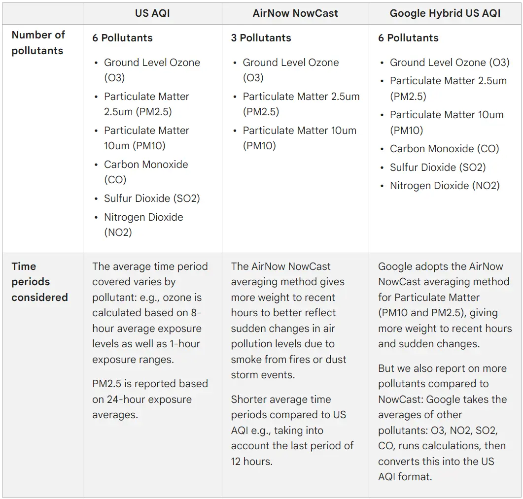
Google’s AQI system differs significantly from traditional government air quality indexes in estimating and interpreting pollution levels. Most governmental AQIs, such as the U.S. EPA AQI, use a standardised set of pollutants that typically include PM2.5, PM10, ozone (O3), nitrogen dioxide (NO2), sulfur dioxide (SO2), and carbon monoxide (CO). Google’s model focuses on these same core pollutants for the AQI calculation but uses a NowCast-style approach to weight recent pollutant levels more heavily, allowing for more real-time responsiveness to sudden changes in air quality.

Image from Air Quality on Google. This graph also explains why the U.S. AQI and AirNow NowCast often show differing results.
Governmental AQIs generally prioritize the most common pollutants with the greatest health impacts. For example:
Google’s model tracks the same pollutants as the U.S. EPA AQI but updates data on an hourly basis, applying its NowCast-style weighting to emphasise recent trends in pollutant concentrations.
Because Google’s system applies real-time weighting and predictive modelling, it can report an AQI that diverges from government platforms, even when assessing the same general location. For example, during a dust storm or wildfire, Google’s AQI may reflect worsening conditions faster due to its responsiveness, while a government AQI using a 24-hour average may lag behind.
It’s also worth noting that each AQI system defines its own pollutant concentration thresholds and assigns different levels of health concern to these values. For example, an AQI of 100 for PM2.5 in the U.S. might correspond to a different concentration threshold compared to the European or Indian AQI systems. Google’s AQI uses the U.S. EPA AQI scale as a baseline but can still present different values due to its predictive algorithms and emphasis on recent data.
While knowing the differences in AQI calculation is essential for understanding some of the variations in readings with Google Maps and other platforms, it doesn’t explain all of the discrepancies. This is because Google has a lot more data collection going on behind the scenes. Here’s how Google collects and processes its data to build such a detailed air quality map:
After you’ve enabled the map overlay, you’ll quickly notice that Google Maps appears to have more comprehensive air quality coverage than many conventional air quality maps. For instance, even AirNow’s Fire and Smoke map - despite its thousands of data points across the U.S. - may still show gaps in coverage, whereas Google presents what seems like complete data coverage for entire regions. But how is this possible, even when there are no monitors within a few kilometres?

Google’s ability to fill these gaps lies in its ‘Fusion Approach,’ which combines data from multiple sources, including:
By synthesizing this data - especially satellite information - Google estimates pollutant concentrations and provides coverage in areas with few or no physical monitors. However, Google’s AQI values often align closely with those of local platforms in cities with dense networks of reference-grade government monitoring stations.
What sets Google apart is its incorporation of factors like traffic data, which is unique to this platform. These additional data points give Google the ability to estimate hyper-localized pollution levels that traditional platforms may not capture.
However, because Google integrates data from so many different sources, the timeliness of the data can vary. While Google updates its air quality map hourly, some sources—such as government data—may report pollutant levels as 24-hour averages. This can introduce slight delays or discrepancies, particularly during rapidly changing conditions such as wildfires or dust storms.
In many cases, this delay will have little impact on the overall picture. However, the platform may not fully reflect real-time conditions during events where air quality changes quickly. Nevertheless, the Google Maps air quality overlay stands out as one of the most data-rich air quality maps available. Its combination of data from reference-grade monitors and additional sources like satellite data makes it uniquely comprehensive. However, as noted earlier, this abundance of data also means that discrepancies between Google and other platforms, such as the AirGradient Map, are to be expected.
As we’ve already alluded to, there are some big advantages and disadvantages of the Air Quality Map provided by Google. Let’s discuss those in a bit more detail.
Overall, Google Maps and other air-quality-focused platforms have significant advantages and disadvantages, and it will be up to you to decide which is more important. In most cases, Google Maps will provide enough insight for general users who only want to know the current air quality. However, a dedicated air quality platform is still better for anyone who wants to examine the data further.
When considering the pros and cons of both types of map platforms, a trend quickly becomes noticeable. For the best data, a personal air quality monitor is still undoubtedly the best option. These devices can provide hyper-local information and monitor the air you’re actually breathing—not the air 2km away at the nearest reference station or as modelled by satellite imagery. Furthermore, they provide historical data and actionable insights.
The best part is that anyone with an air quality monitor can contribute to these platforms. Many maps, such as AirVisual and AirNow, use data from affordable air quality monitors, and by having your own monitor, you can help raise awareness about air quality.
Additionally, platforms that focus on crowd-sourced data, such as the AirGradient Map, demonstrate how a large number of affordable sensors can improve air quality coverage globally. These networks create more localised and accurate readings while empowering individuals to take action and share valuable insights with their communities.
Curious about upcoming webinars, company updates, and the latest air quality trends? Sign up for our weekly newsletter and get the inside scoop delivered straight to your inbox.
Join our Newsletter
We design professional, accurate and long-lasting air quality monitors that are open-source and open-hardware so that you have full control on how you want to use the monitor.
Learn More