Open and Accurate Air Quality Monitors
We design professional, accurate and long-lasting air quality monitors that are open-source and open-hardware so that you have full control on how you want to use the monitor.
Learn MoreThis is the continuation of the previous post called How we use Linear Regression to Drastically Improve Humidity Sensor Accuracy on using a linear regression model to improve the accuracy of relative humidity. So this post will purely look at the technical implementation using the statistical computer language R.
Please ensure that you have R and RStudio Desktop installed on your computer. To do so just follow the instructions on the RStudio Website.
In this example we need three R libraries, namely:
library(dplyr)
library(ggplot2)
library(ggpmisc)
The first time you use these libraries on your computer you need to install them. You can do this if you type into the RStudio Console the following command:
install.packages('dplyr','ggplot2','ggpmisc')
In this example we will use the same data that I used in the previous blog post. If you use other data, it is important that you clean and format the data so that there will be no problems when processing it in R. Here are a few things you need to keep in mind:
It is very important that R recognises your date format. You can use below command to format a column to date format. Below code for example would format the UTC date from the AirGradient export file to be recognised as UTC date in R.
data$date_time_utc = as.POSIXct(data$date_time_utc, "%Y-%m-%dT%H:%M:%OS", tz = "UTC")
Sometimes also numbers are wrongly recognised as text. If that happens below command formats them as numbers.
data$temp_degc = as.numeric(data$temp_degc)
As you can see already in above example, "data" is the name of the table (called data frame in R) and then the name of the column is attached with the "$" character.
For this example we use the raw in the following format:
| date_time_utc | temp_degc | rh_per | monitor | type | location |
|---|---|---|---|---|---|
| 2023-08-07 23:00:00 | 28.5 | 78 | th_ref | ref | th |
| 2023-08-07 22:00:00 | 28.4 | 78 | th_ref | ref | th |
date_time_utc: This is the UTC time stamp in the format YYYY-MM-DD HH:MM:SS
temp_degc: This column contains temperature data in degrees Celsius
rh_per: This column contains relative humidity data in percent
monitor: This is a short name for the monitor
type: This distinguishes between "ref" for reference data and "ag" for the sensor data
location: This marks the location or country in our case. "th" for Thailand and "uk" for the United Kingdom
We have made the complete dataset with above structure available for you in the R specific format RDS. You can download the dataset from here.
Then save it in the same directory like your R script.
With the following line of code you can read the RDS file into RStudio:
data = readRDS("data-uk-th-rh.rds")
In case you get an error during the reading you might need to select in the RStudio menu bar "Sessions", "Set Working Directory", "To Source File Location".
Once its successfully loaded you can see the data frame in the data window in RStudio. Clicking on it opens the data in a tab, and you can have a look at it.
In order to compare the reference and sensor data, we need to put them into the same rows. So instead of having only one column with the relative humidity data, we need two columns. One with the reference data and one with the sensor data.
To do this we first filter the current data frame into two sets. One for reference data and one for sensor data:
data_ag <- filter(data, type == 'ag')
data_reference <- filter(data, type == 'ref')
In this case we call the sensor data "ag" for our AirGradient monitors.
In the next step we need to merge the data. To do this we use the following command:
data_all = merge(data_ag, data_reference, by = c("date_time_utc","location"), suffixes=c(".ag", ".ref"))
This creates a new data frame called "data_all" and it merges the data that has the same date and location into one row. Since we have two relative humidity and two temperature values for each row (one for the reference, one for the sensor), it will use the suffixes "ref" and "ag" to mark them.
When we open this new data frame we see the following:
| date_time_utc | location | temp_degc.ag | rh_per.ag | monitor.ag | type.ag | temp_degc.ref | rh_per.ref | monitor.ref | type.ref |
|---|---|---|---|---|---|---|---|---|---|
| 2023-08-07 23:00:00 | uk | 15.9 | 37 | uk_ag | ag | 17.5 | 39 | th_ref | ref |
Now you can see that the relative humidity for the reference and the sensor are in the same row. One column called "rh_per.ref" and the other "rh_per.ag". The same for the temperature.
This structure is now a very good base for calculating the linear regression and charting the data.
As discussed in How we use Linear Regression to Drastically Improve Humidity Sensor Accuracy, we need to filter the data into a training set. We can use below command. It will filter the uk training data and create a data frame with only the time between 2023-02-06 and 2023-03-31.
data_all_training = filter(data_all, between(date_time_utc, as.Date("2023-02-06"), as.Date("2023-03-31")) & location == "uk")
Now we can apply a linear fit for the training set with below command:
model_rh <- lm(rh_per.ref ~ rh_per.ag, data = data_all_training)
After running this command, you can print out the offset and scaling factors with below commands:
print(paste("Offset Factor: ", model_rh$coefficients[1], "and Scaling Factor: ", model_rh$coefficients[2]))
Now that we have the offset and scaling factors, we can calculate the corrected values and add them to our default data table. This can be done with one line of code:
data_all$rh_per.corrected = model_rh$coefficients[2] * data_all$rh_per.ag + model_rh$coefficients[1]
So this is creating a new column called "rh_per.corrected" which takes the original sensor value "rh_per.ag" and applies the offset and scaling factor to it.
So now after running it, we see an additional column "rh_per.corrected" in our data_all table:
| date_time_utc | location | temp_degc.ag | rh_per.ag | monitor.ag | type.ag | temp_degc.ref | rh_per.ref | monitor.ref | type.ref | rh_per.corrected |
|---|---|---|---|---|---|---|---|---|---|---|
| 2023-08-07 23:00:00 | uk | 15.9 | 37 | uk_ag | ag | 17.5 | 39 | th_ref | ref | 39.6522 |
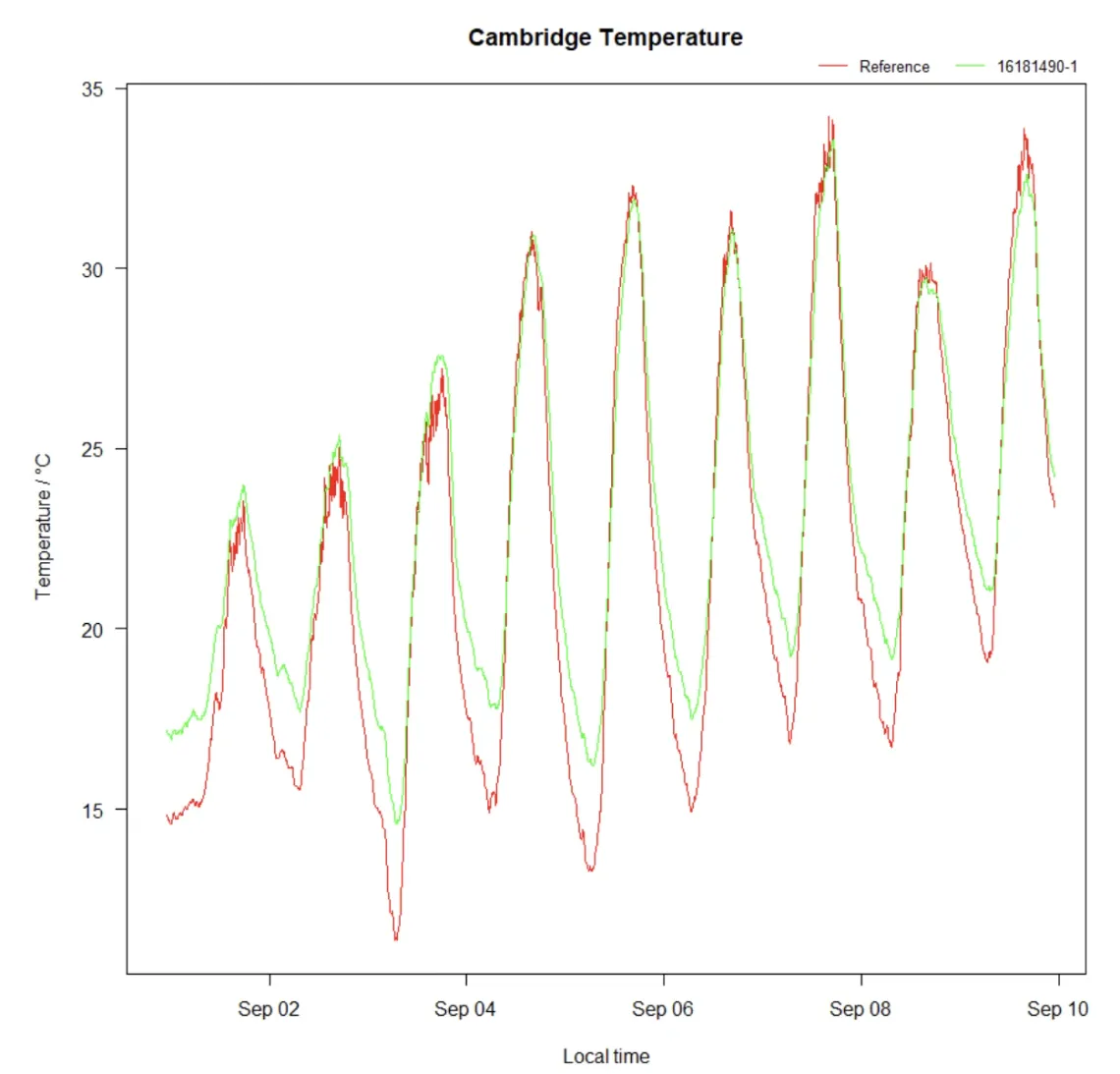
Please note that we applied this new column in the data frame "data_all" which is the complete dataset and not only the training period. So if you now plot the columns "rh_per.ref" and "rh_per.corrected" you will see the agreement between the referemce data and the corrected sensor data for the complete time frame.
Although not strictly required for the compensation algorithm, here are the two plots that I have used in my previous article.
ggplot(data_all, aes(x=date_time_utc)) +
ylim(0, 100) +
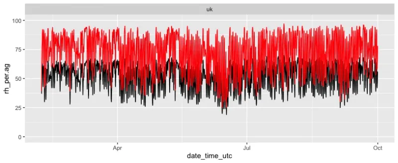
geom_line(aes(y = rh_per.ag), color="black") +
geom_line(aes(y = rh_per.ref), color="red")
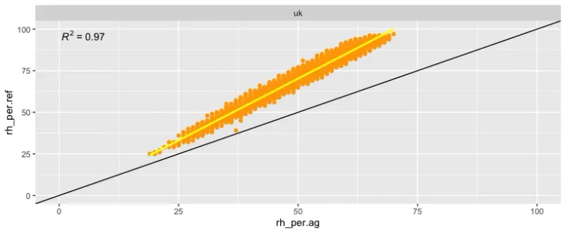
ggplot(data_all, aes(x=rh_per.ag, y=rh_per.ref)) +
  geom_point(colour = "orange") +
  geom_smooth(method = "lm", se = FALSE, colour = "yellow") +
  geom_abline() +
  stat_poly_eq() +
  xlim(0, 100) +
  ylim(0, 100)
Here is the complete script that you can just copy and paste into your RStudio.
library(dplyr)
library(ggplot2)
library(ggpmisc)

data = readRDS("data-uk-th-rh.rds")

colnames(data)

data <- filter(data, location == 'th')

# Seperate ag and reference
data_ag <- filter(data, type == 'ag')
data_reference <- filter(data, type == 'ref')


# Merging
data_all = merge(data_ag, data_reference, by = c("date_time_utc","location"), suffixes=c(".ag", ".ref"))
colnames(data_all)

data_all_training = filter(data_all, between(date_time_utc, as.Date("2023-02-06"), as.Date("2023-03-31")) & location == "uk" |
                             between(date_time_utc, as.Date("2023-05-01"), as.Date("2023-06-30")) & location == "th")

data_all_training = filter(data_all, between(date_time_utc, as.Date("2023-02-06"), as.Date("2023-03-31")) & location == "uk")


ggplot(data_all, aes(x=date_time_utc)) +
  ylim(0, 100) +
  geom_line(aes(y = rh_per.ag), color="black") +
  geom_line(aes(y = rh_per.ref), color="red") +
  facet_wrap(~location)


ggplot(data_all, aes(x=rh_per.ag, y=rh_per.ref)) +
  geom_point(colour = "orange") +
  geom_smooth(method = "lm", se = FALSE, colour = "yellow") +
  geom_abline() +
  stat_poly_eq() +
  xlim(0, 100) +
  ylim(0, 100) +
  facet_wrap(~location)

# Fit a linear regression model for Training Set
model_rh <- lm(rh_per.ref ~ rh_per.ag, data = data_all_training)
print(paste("Offset Factor: ", model_rh$coefficients[1], "and Scaling Factor: ", model_rh$coefficients[2]))

data_all$rh_per.corrected = model_rh$coefficients[2] * data_all$rh_per.ag + model_rh$coefficients[1]
data_all$rh_per.corrected.uk = 1.500574 * data_all$rh_per.ag -4.76

rmse_rh_cal_before = sqrt(mean((data_all$rh_per.ref - data_all$rh_per.ag)^2))
rmse_rh_cal_after = sqrt(mean((data_all$rh_per.ref - data_all$rh_per.corrected.uk)^2))

ggplot(data_all, aes(x=date_time_utc)) +
  ylim(0, 100) +
  geom_line(aes(y = rh_per.corrected), color="black") +
  geom_line(aes(y = rh_per.ref), color="red") +
  facet_wrap(~location)

ggplot(data_all, aes(x=rh_per.corrected.uk, y=rh_per.ref)) +
  geom_point(colour = "orange") +
  geom_smooth(method = "lm", se = FALSE, colour = "yellow") +
  geom_abline() +
  stat_poly_eq() +
  xlim(0, 100) +
  ylim(0, 100) +
  facet_wrap(~location)
As you can see, it is not really difficult to develop well working compensation algorithms. Above is a very simple approach and intended to give beginners an entry point. In case you have any questions of problems, please head over to the AirGradient Forum.

We design professional, accurate and long-lasting air quality monitors that are open-source and open-hardware so that you have full control on how you want to use the monitor.
Learn MoreCurious about upcoming webinars, company updates, and the latest air quality trends? Sign up for our weekly newsletter and get the inside scoop delivered straight to your inbox.
Join our Newsletter